Urbis — Brighouse
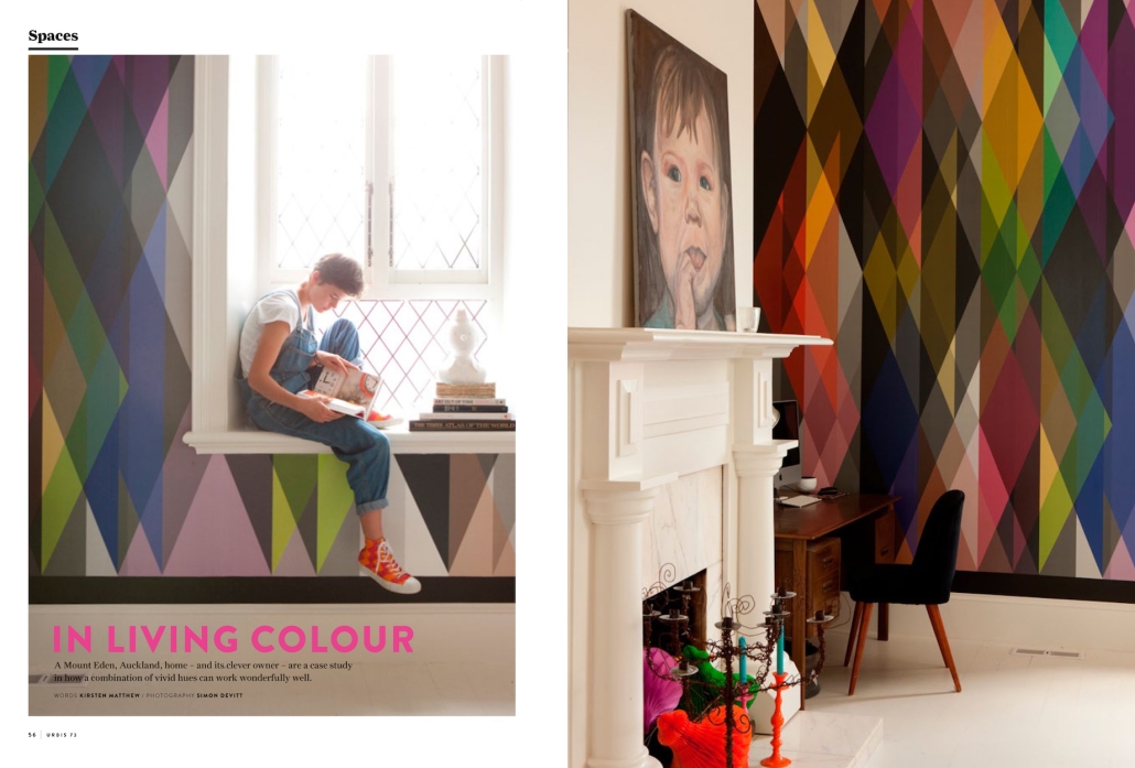
A Mount Eden, Auckland, home- and its clever owner – are a case study in how a combination of vivid hues can work wonderfully well.
A Mount Eden, Auckland, home – and its clever owner – are a case study in how a combination of vivid hues can work wonderfully well.
It was a single roll of wallpaper that inspired Anya Brighouse’s home. She spied the Cole & Son design in an overseas magazine before she’d bought the five-bedroomed, Mount Eden home in which she now lives – and knew instantly that it would be the basis for the palette she would use in her next house.
“I said, ‘That’s it!’” Brighouse says of the diamante-print paper that now covers a wall in her library. “It is so strong even I wasn’t sure if I was doing something a bit silly, but we balanced it with old furniture and quirky art.”
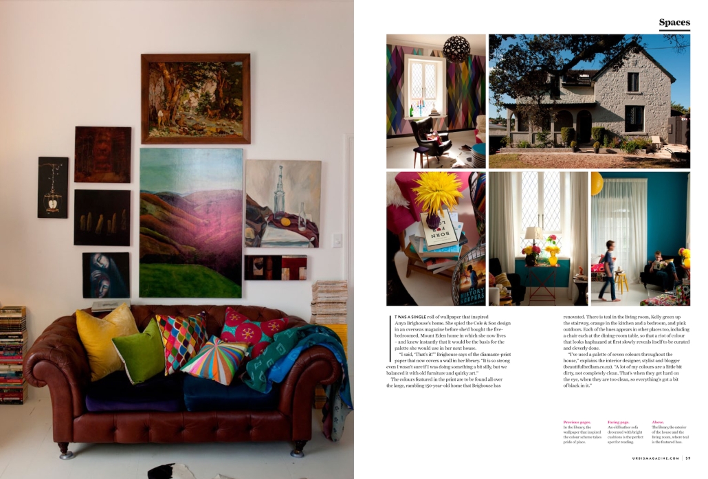
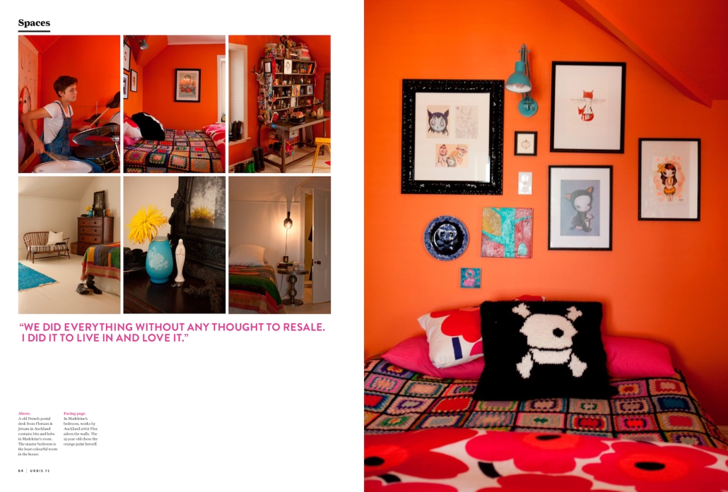
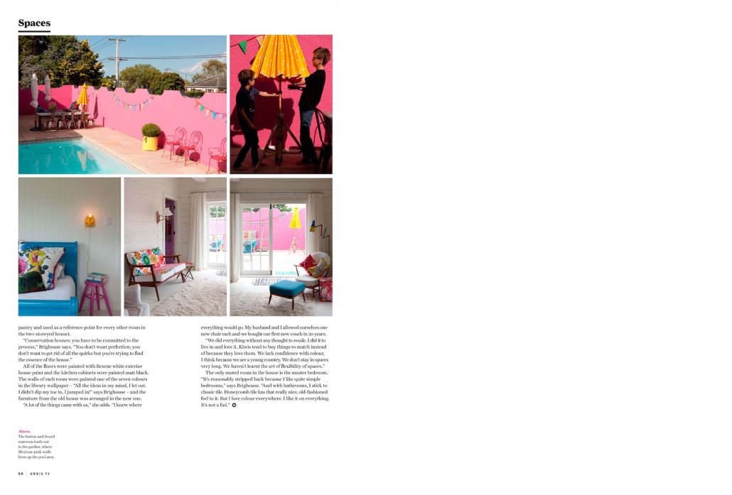
The colours featured in the print are to be found all over the large, rambling 150-year-old home that Brighouse has renovated. There is teal in the living room, Kelly green up the stairway, orange in the kitchen and a bedroom, and pink outdoors. Each of the hues appears in other places too, including a chair each at the dining-room table, so that a riot of colour that looks haphazard at first slowly reveals itself to be curated and cleverly done.
“I’ve used a palette of seven colours throughout the house,” explains the interior designer, stylist and blogger. “A lot of my colours are a little bit dirty, not completely clean. That’s when they get hard on the eye, when they are too clean, so everything’s got a bit of black in it.”
The two-storeyed family home isn’t Brighouse’s first foray into colour. She first learnt how to add vibrant shades to interiors when visiting her godmother in Copenhagen, Denmark. “In Copenhagen, they live in tiny apartments but they paint them burgundy or forest green,” she explains. “Who says you have to have white on white, a white box?”
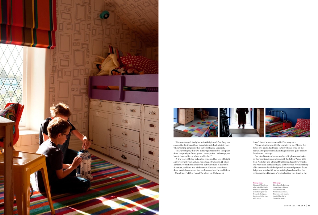
A few years of living in London cemented her love of bright and breezy interiors and, on her return, Brighouse, 47, filled her first Mount Eden home with her collections of colourful furniture, cushions and kitchenware. She then transferred them to this house when she, her husband and three children – Madeleine, 15, Riley, 13, and Theodore, 10, (Melaina, 25, doesn’t live at home) – moved in February 2012.
“Houses that are outside the box interest me. I’d seen this house two-and-a-half years earlier, when it went on the market. It’s quintessentially an English house: quite a simple farmhouse,” she says.
Once the bluestone house was hers, Brighouse embarked on four months of renovations, with the help of Adam Wild from Archifact and a team of builders and painters. Thanks to a renovation in the late 1970s, the house had forsaken many of its character details for Spanish arches and parquet floors. Brighouse installed Victorian skirting boards and had the ceilings restored (a scrap of original ceiling was found in the pantry and used as a reference point for every other room in the two-storeyed house).
“Conservation houses: you have to be committed to the process,” Brighouse says. “You don’t want perfection; you don’t want to get rid of all the quirks but you’re trying to find the essence of the house.”
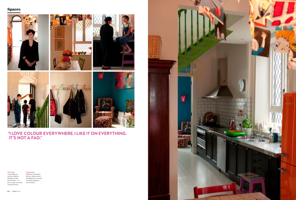
All of the floors were painted with Resene white exterior house paint and the kitchen cabinets were painted matt black. The walls of each room were painted one of the seven colours in the library wallpaper – “All the ideas in my mind, I let out. I didn’t dip my toe in, I jumped in!” says Brighouse – and the furniture from the old house was arranged in the new one.
“A lot of the things came with us,” she says. “I knew where everything would go. My husband and I allowed ourselves one new chair each and we bought our first new couch in 20 years.
“We did everything without any thought to resale. I did it to live in and love it. Kiwis tend to buy things to match instead of because they love them. We lack confidence with colour, I think because we are a young country. We don’t stay in spaces very long. We haven’t learnt the art of flexibility of spaces.”
The only muted room in the house is the master bedroom.
“It’s reasonably stripped back because I like quite simple bedrooms,” says Brighouse. “And with bathrooms, I stick to classic tile. Honeycomb tile has that really nice, old-fashioned feel to it. But I love colour everywhere. I like it on everything. It’s not a fad.”

