Apalmanac – Bivvy House
Simon Devitt Photographs a Stunning Getaway in New Zealand’s Southern Alps
“Simon Devitt is a fantastic architectural photographer based in Auckland, New Zealand. Bivvy House is a one-of-a-kind project on New Zealand’s incredible South Island. Here we have what I’d call a match made in architectural photography heaven” – Lexi Taciak.
Originally I had set out to feature one of Simon’s other beautiful projects – Scrubby Bay. Simon, in the customarily friendly Kiwi way, obliged but also suggested another one of his works; Bivvy House by architect Vaughn McQuarrie.
What I appreciate most about these photographs of Bivvy House are their cohesiveness as a series and how despite the wide variety of images, they all contribute to the story of the landscape and the building in relation to one another. Let’s check it out!
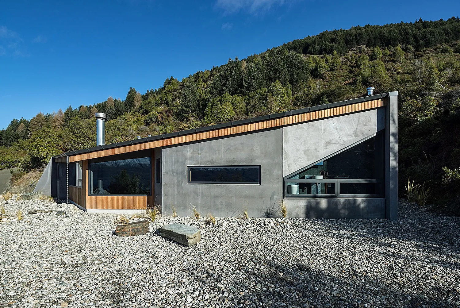
Bivvy House is located near Queenstown, NZ. Touting the 2019 NZIA Southern Architecture Award and the Finalist Home in NZ Home of the Year 2019, it is obviously a sight to behold. What I think Simon captures best in this series is how it feels to be at Bivvy House. The colors are cool and crisp, just like the air. There are interesting shadows and metallic highlights on the facade. Delicate details like the reflection of the mountains in the window reinforce a sense of place.
Inside, Simon places the outstanding view as the focal point. After all; nature is the best art in the world. The ever so slight haze over the mountains helps our brains register that they are far away, in turn giving their massive size some scale and impact. The light streaming in from the windows adds dimension and give an otherwise cool scene a little warmth, helping us perceive what it’s like to be standing there taking in that view.
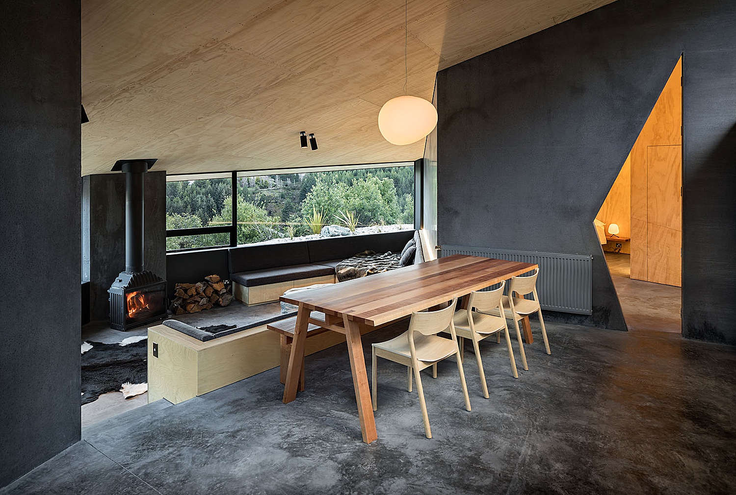
A wider and more encompassing shot gives us a roadmap for navigating through this floorplan. The orange slice of doorway grabs our attention and leads us into the next room of the house.
The generous glazing allows for plenty of natural light which penetrates deep into the living areas. The light, which is shaped by the angular rooflines, offers an interesting contrast to the dark interior palette. What a spot to have breakfast, right?
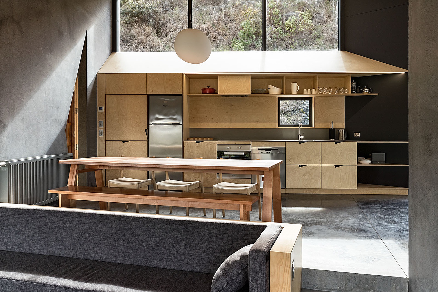
The view of the kitchen from the living room gives us more understanding of the space. I appreciate Simon including the built-in seating in the living room to give us a little context. Look at that specular light pouring over the cabinets and onto the concrete; the shadows on the chair cushions and diagonal lines produced by the shelving create a nice dimensionality in this scene.
When is the last time you photographed a room with lasers of light? Simon sets up his perspective to include both of these fun design features. They act as guides to pull our eyes through the image, settling last on that little red pair of slippers beneath the chair, an absolutely brilliant touch giving us a colorful focal point in an otherwise mostly monochromatic image. This delicate composition is neither too wide nor too tight, and leaves just enough for the imagination. The room feels perfectly natural in both volume and light levels.
When is the last time you photographed a room with lasers of light? Simon sets up his perspective to include both of these fun design features. They act as guides to pull our eyes through the image, settling last on that little red pair of slippers beneath the chair, an absolutely brilliant touch giving us a colorful focal point in an otherwise mostly monochromatic image. This delicate composition is neither too wide nor too tight, and leaves just enough for the imagination. The room feels perfectly natural in both volume and light levels.
Back to the art hanging on the walls. Oh, oops – the view. Good lord, the view.
Throughout the Bivvy House project, elements from the environment are brought indoors. A stone from the building site is used in the shower/bath area. The chosen perspective gives more repetition and movement to the tiles, plus shows off the fixtures and other features of the bathroom – such as the windows and mirror. Simon is able to show us that the shower actually fills with water as a tub. Exhibiting the clever design elements of the house goes beyond just making a good picture, but truly tells the viewer about a place.
Back outside for a twilight photo, Simon gives us a subtle sky which drives the interest where it’s supposed to be: the house. While definitely attention-grabbing, the tungsten interior lights aren’t blisteringly bright nor are they too orange or green. It looks exactly as it should. Beauty in subtlety.
In these twilight images, Simon teaches a masterclass in light and shadow. The warm light is a perfect contrast to the desaturated blues of the exterior, inviting us inside from the cold – a place of respite in the windy, chilly, and beautiful mountains – exactly as this house was intended to be.
We’ll close out this Project of the Week with the image that really says it all about this project. Simon shows us the home perched overlooking that epic view which is truly one of a kind. From this angle, the shape of the mountain is echoed by the way the lake which cuts through the trees. This, in turn, leads our eyes down to the house, which also shares this triangular shape. Pattern and repetition in nature and architecture coming together and captured perfectly. Sublime! Add the smoke from the woodstove as well as the gentle interior lights. I feel like I’m there.
Infinite Thank-Yous to Simon Devitt for sharing his photos of Bivvy House with us. I’m not exaggerating when I say that all of Simon’s work is fantastic and totally worth your time to check out.


