Mangawhai Estuary Home—Winner of Home Magazine Awards Rural Home of the Year
Ebb and Flow
Words: Clare Chapman
The 2024 Rural Home of the Year | Mangawhai Estuary House by Belinda George Architects
Moving between sweeping curves and overt gestures of permanence, this Mangawhai home opens up and reaches out to the estuarine landscape beyond, welcoming visitors and the view with a dynamic spatial interplay.
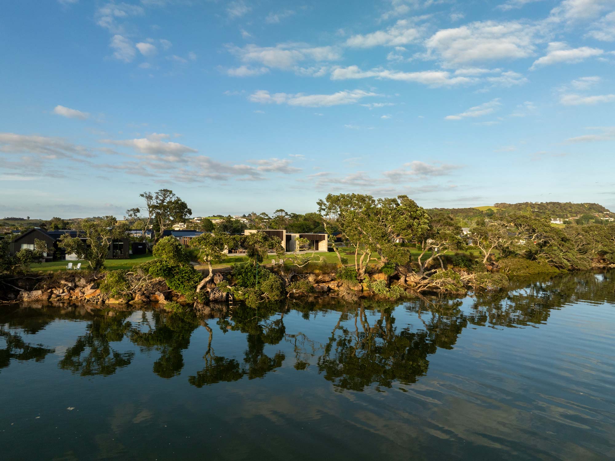
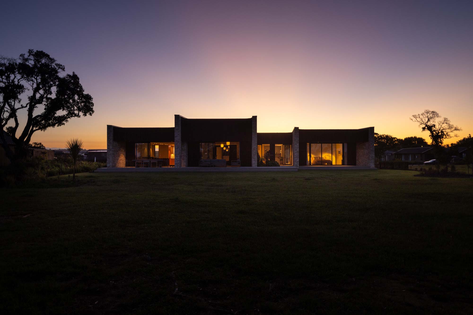
Conceived as a response to the wider natural environment, the home embraces it on many levels — some imperceptible and others grand. One of a handful of waterfront sections in a relatively new subdivision in Mangawhai, the site borders a public coastal walkway that winds along the edge of the estuary.
There are no fences or visible boundaries between private and public land, so movement between the two is organic. Here, visitors and passers-by meander on the grass verging the estuary, sometimes seeking shade under the pōhutukawa that line its banks.
It’s a landscape that changes dramatically throughout the day, as the tide comes and goes. When the tide is in, the water is often dotted with kayakers and paddleboarders making the most of the calm waters.
Birdlife is abundant, and the shallow waters of the estuary provide an important breeding ground for marine life. When the tide edges out, the flats become a swirling expanse of pattern and texture.
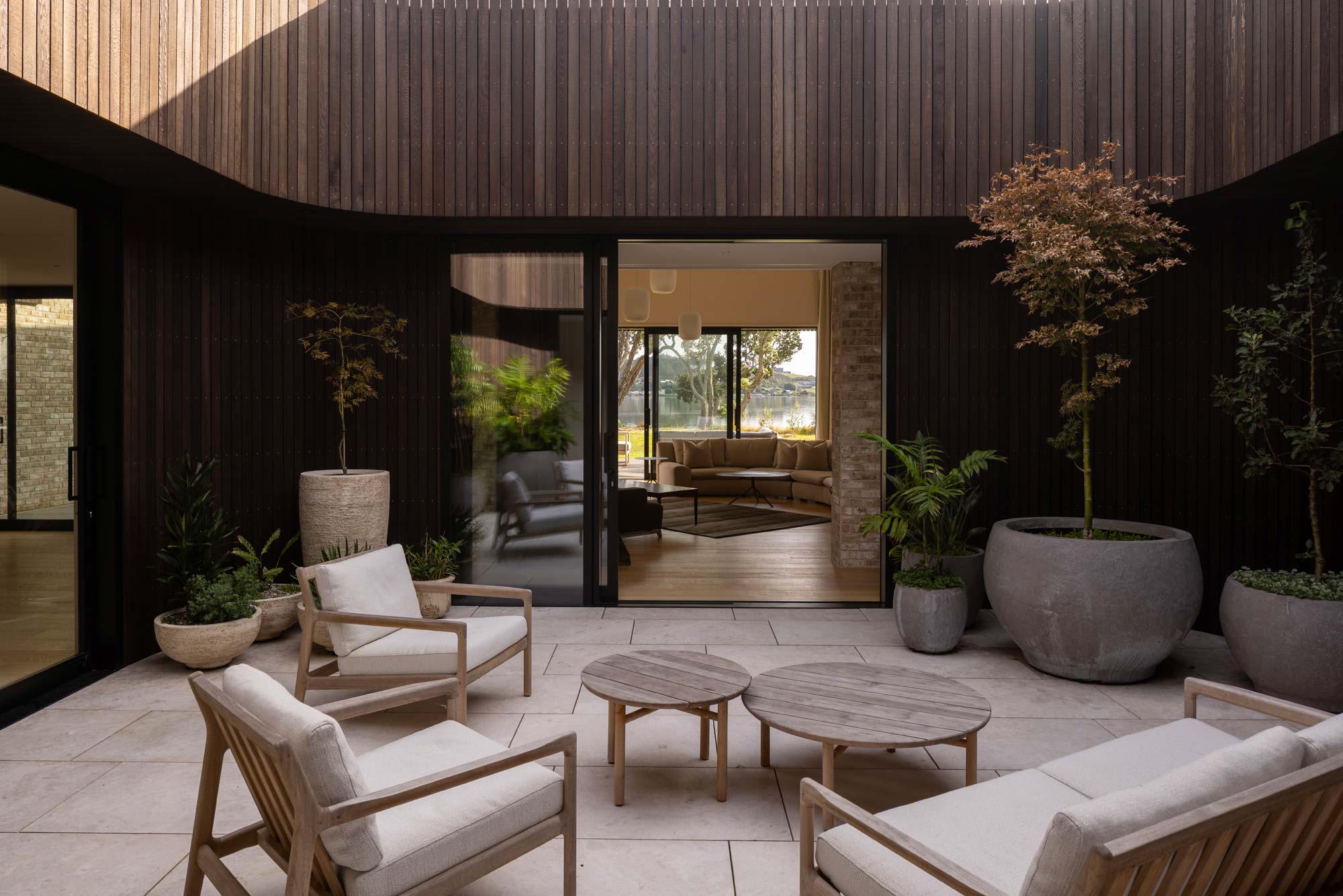
“We were given quite an open brief for this home; the only non-negotiables were that the house needed to be all one level and to include an internal courtyard,” architect Belinda George tells us of her clients’ wishes.
“This openness allowed us to take a strong conceptual idea and translate that into our design. From the beginning, it was the wider elements of the landscape we were drawn to — the juxtaposition between the solid, unmoving elements of the estuarine environment and the ebb and flow of the tidal waters that moved around them; little eddies, the movement of water, of sand, and the way the estuary fans out into the sea.”
It is these subtle but vital parts of this ever-changing environment that are echoed in the architecture, most notably captured in the essence of the plan that artfully fuses flow and solidity.
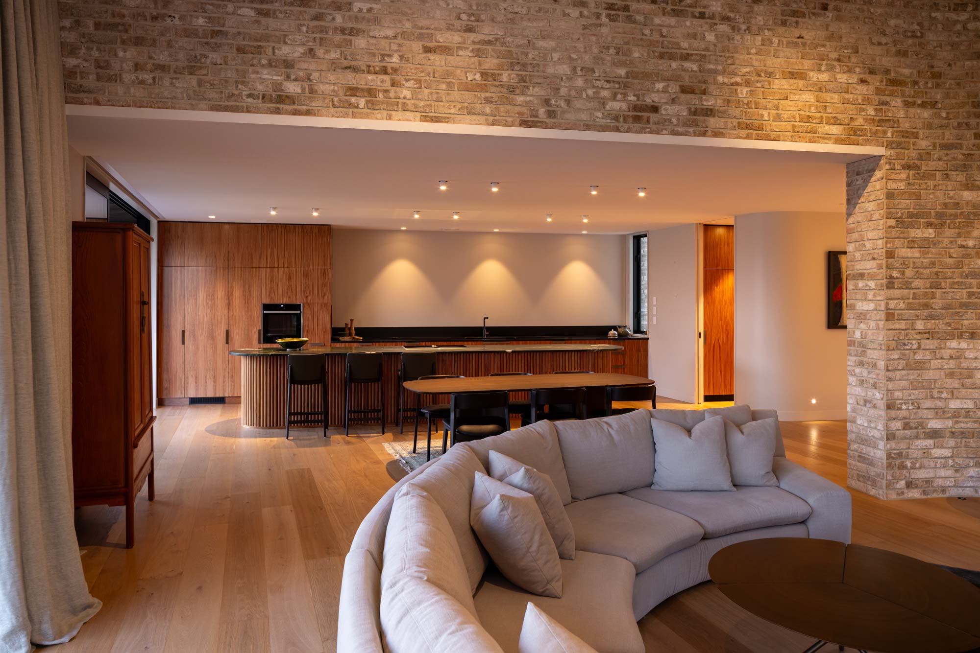
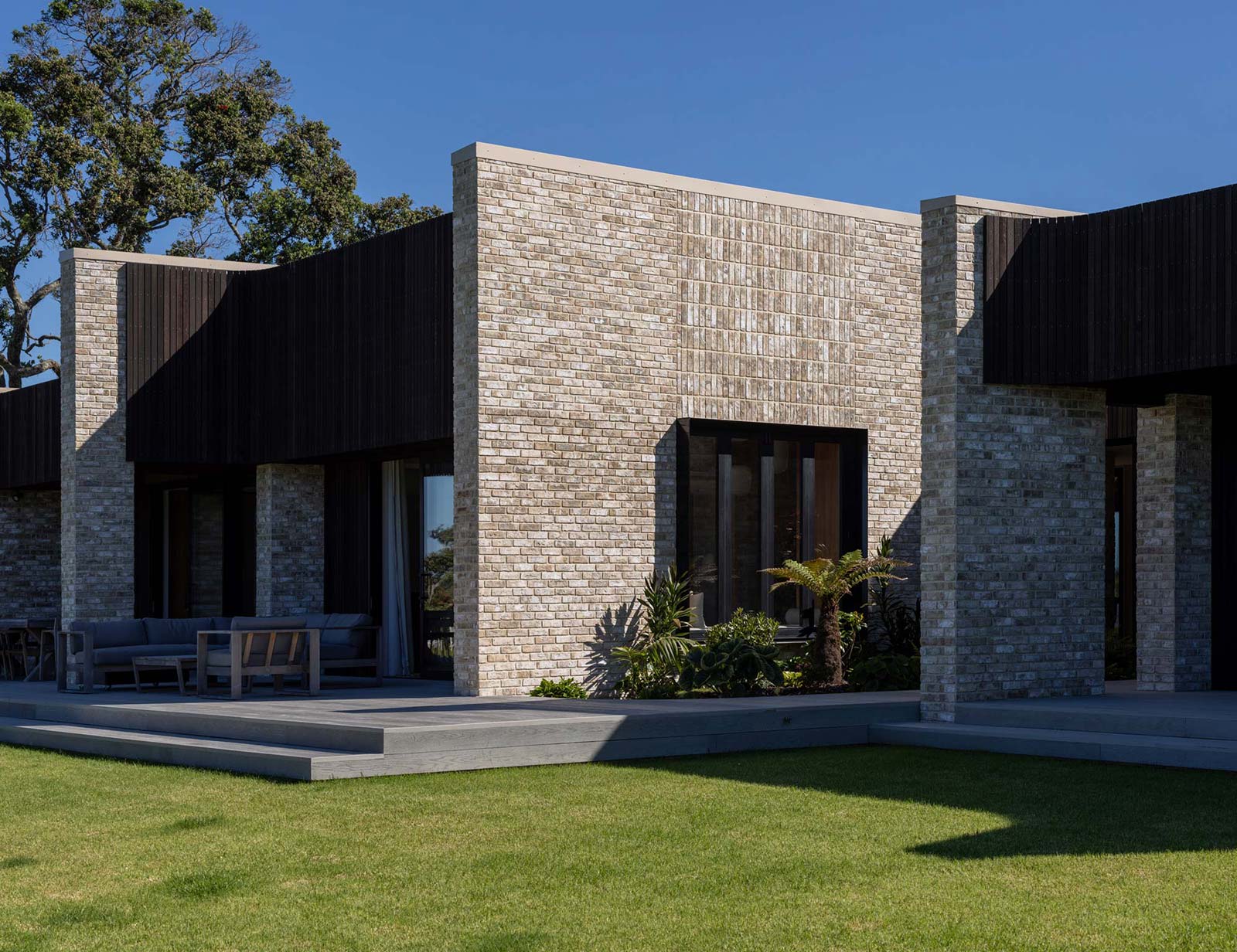
“The central open courtyard became the first solid object, around which flowing spaces are interconnected,” Belinda tells us. “The curving brick walls form the next aspect of solidity, and balance the fluidity of the spaces around them.”
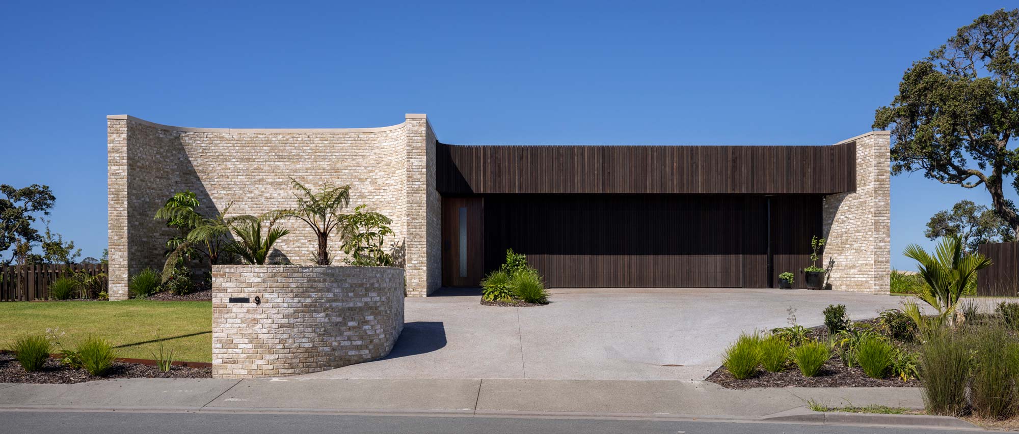
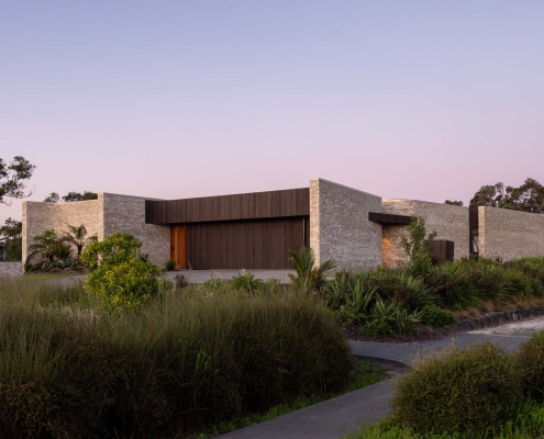
Approaching the house from the street, these striking proportions and curving geometries are introduced with a subtle but unapologetic flair that sets this home decidedly apart from the surrounding vernacular.
“We wanted to present quite a non-dramatic elevation to the street while also introducing the brick and curves without giving too much away,” Belinda tells us.
To the left is the first curved brick wall visible to the visitor; to the right is an expanse of vertical cedar; in between them is the pedestrian entry, a compressed space at odds with the sweeping forms either side.
“The curved wall is almost stage-like, a place for a landscaping feature that gives a hint of theatrics going on behind it.”
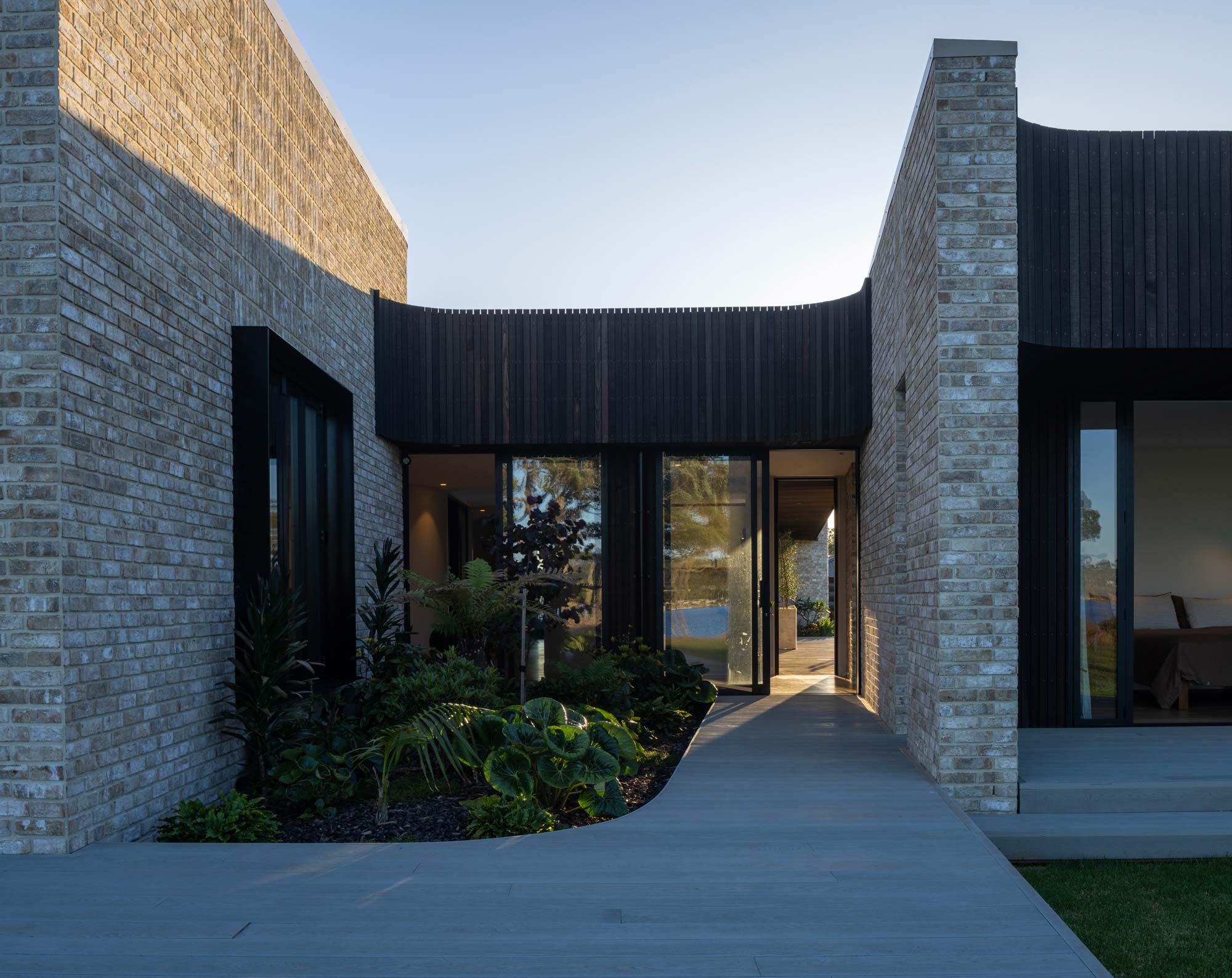
Step inside, and the theatrical experience is immediate. Sightlines through the house offer the first glimpse of the estuary beyond, drawing the visitor through the space, around a series of curving walls where light dances poetically across textural surfaces.
“It’s the beginning of the notion of ‘flow’ that was central to the whole concept,” Belinda says. “The idea was to take those circulation spaces and use them in a positive way, not just as places to pass through but as habitable spaces to experience and use.”
One of those was envisioned as a gallery, an area designed to be sparsely furnished — a place to pause and connect with the foreground, middle ground, and distance to this layered landscape of built and natural forms. Here, full-height glazing draws the eye across lush planting accentuating the external brickwork, beyond to the pōhutukawa-lined bank, and across the estuary.
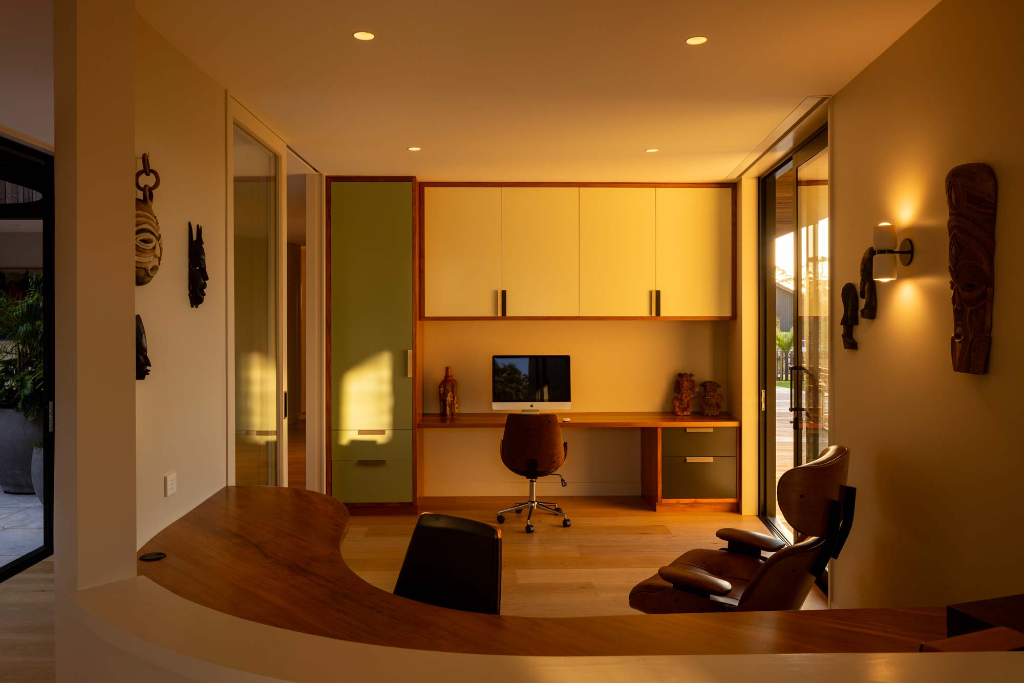
Behind it, an open office is divided from the gallery by a curving desk, allowing for sightlines from the workspace through the building’s outstretched brick arms to the view.
Guest bedrooms and a bathroom are housed along the western side of the house, connecting to a second deck and an area the owners call ‘the orchard’, where young fruit trees are beginning to thrive.
Belinda tells us that the clients wanted to engage with passers-by. “The openness to the walkway and estuary was very much a client-driven choice, which we thought was a brave one. I think it’s a modern condition, the idea of fencing yourself off from the public, and this was a rare but lovely approach to consider in opposition to the norm.
“They tell us so many stories now about lovely interactions — the three year old who runs down on a daily basis to say hello from a couple of houses down, people stopping by for a chat.”
In contrast, the internal courtyard became a more introverted space; an outdoor area where moments of privacy could be curated as desired. As the central space around which all others transition and flow, this open-air room draws light in throughout the day and exists under the stars at night.
“At night-time there was a desire to shut down a little bit, so being able to have a separate outdoor area in the courtyard was appealing.”
A two-sided curtain can be drawn across the living room to create a private sanctuary to hunker down into, shielded by the interconnected forms around it.
In every element of this home there exists the elegant, woven gestures of a unified creative vision and a poetic response to site and context. As the property dissolves organically into the public realm, there’s a beckoning, an invitation to look back at its outstretched arms — to consider the depth of its composition, and the undeniable narrative and connection it adds to this coastal setting.
Judges’ Citation
Conceptualised as a poetic tribute to the estuarine patterns that define its surroundings, this home embodies a harmonious blend of fluidity and solidity, offering a serene retreat for its occupants.
The single-level layout seamlessly integrates with the natural and social contours of the land. An innovative plan, characterised by a delightful internal courtyard and generous connecting spaces, fosters a sense of fluidity and ease, while curved brick walls exude reassuring solidity and tactility, balancing the dynamic flow of the design. Situated along the public esplanade, the house encourages neighbourly connection with passers-by, opening up to the community while maintaining privacy and tranquility. A thoughtful, beautifully conceived gem along the coastline.
Belinda George Architects Design Team
Belinda George
Erica Kenny


